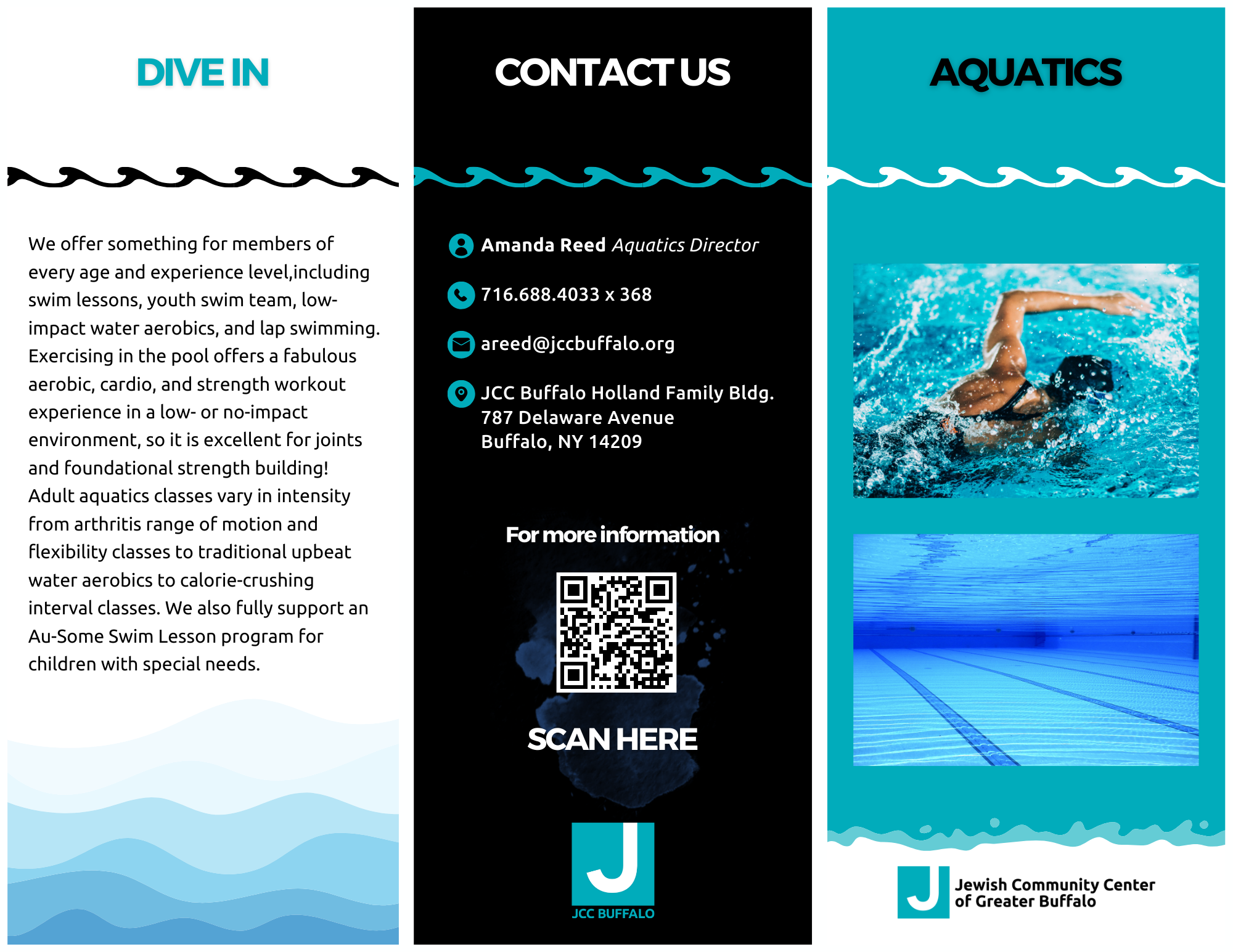
To promote the JCC’s various programs offered to members and visitors, we used brochures as a compact, portable, and visually engaging medium of information. Whether it was for aquatics, afterschool programs, or senior wellness, I designed each brochure to achieve specific goals. Catch and hold the focus of the target demographic, provide all the necessary information, and provide a method of contact or registration. The designs for the brochures were tailored to thematic elements of each department of the organization.

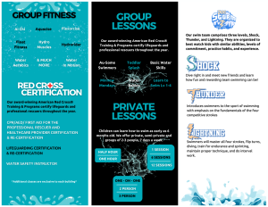
For aquatics, I used waves as the central concept and incorporated different styles of them, taking advantage the JCC’s pre-existing color palette. The goal was to ensure all the vital information about the department was included so that anyone from a parent looking for swim lessons, to a lifeguard needing a certification, can find exactly what they’re looking for.
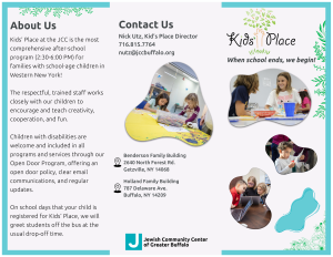
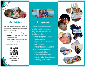
For the Kids’ Place Afterschool Program, I used soft shapes as photo frames and nature elements to reference the logo. The blue and green contrast are a play on the core representations of nature being foliage and water. This brochure’s target demographic is parents looking to enroll their children in programs and activities that will build them in multi-faceted ways.
